The Best Interior Paint Colors
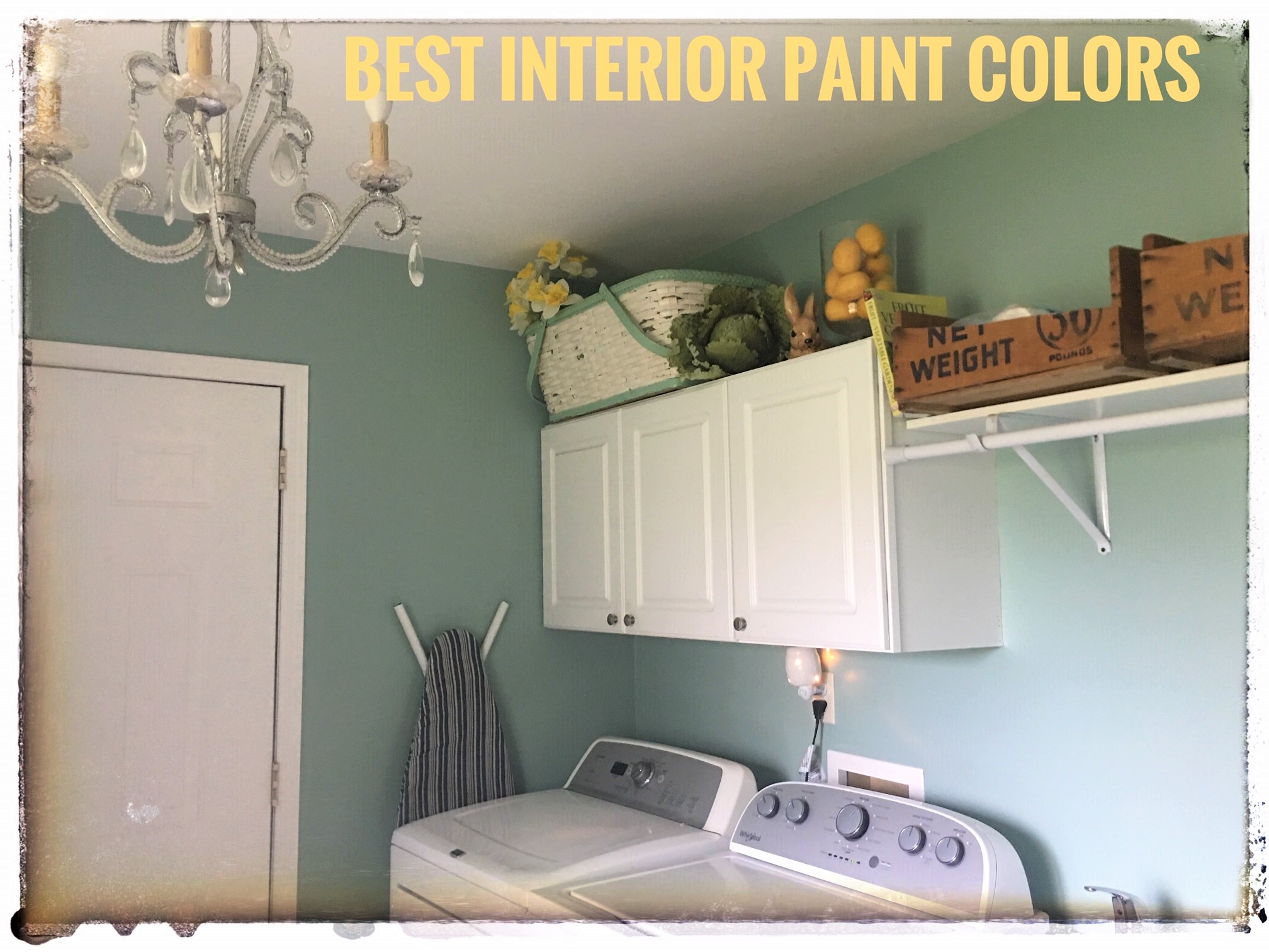
What are the Best Interior Paint Colors? One question I get on nearly every job is: "What colors do you suggest?"
The not-so-simple answer to that is always, "it depends". A homeowner's personality; a room's size, use, shape, lighting, etc... - these all play a role in color choices.
But I do have some favorite interior paint colors, those I find myself going back to again and again. These are timeless, versatile, and the workhorses of the color world.
I’ve had many years to experiment and play with different paint colors, textures, and trends. One of the biggest things I can offer are the experiences and lessons I’ve learned along the way.
There are few things more disappointing than going to a paint store and getting a rep who isn’t helpful or knowledgeable. And one of the most frequent questions people go in with is “what are the best interior paint colors for my home?”
We all know that depends on the space's purpose and the applicator’s personal style and preference, but there are tried and true colors that just seem to work beautifully time and time again.
That Interior Painting Girl's Picks for "Best Interior Paint Colors":
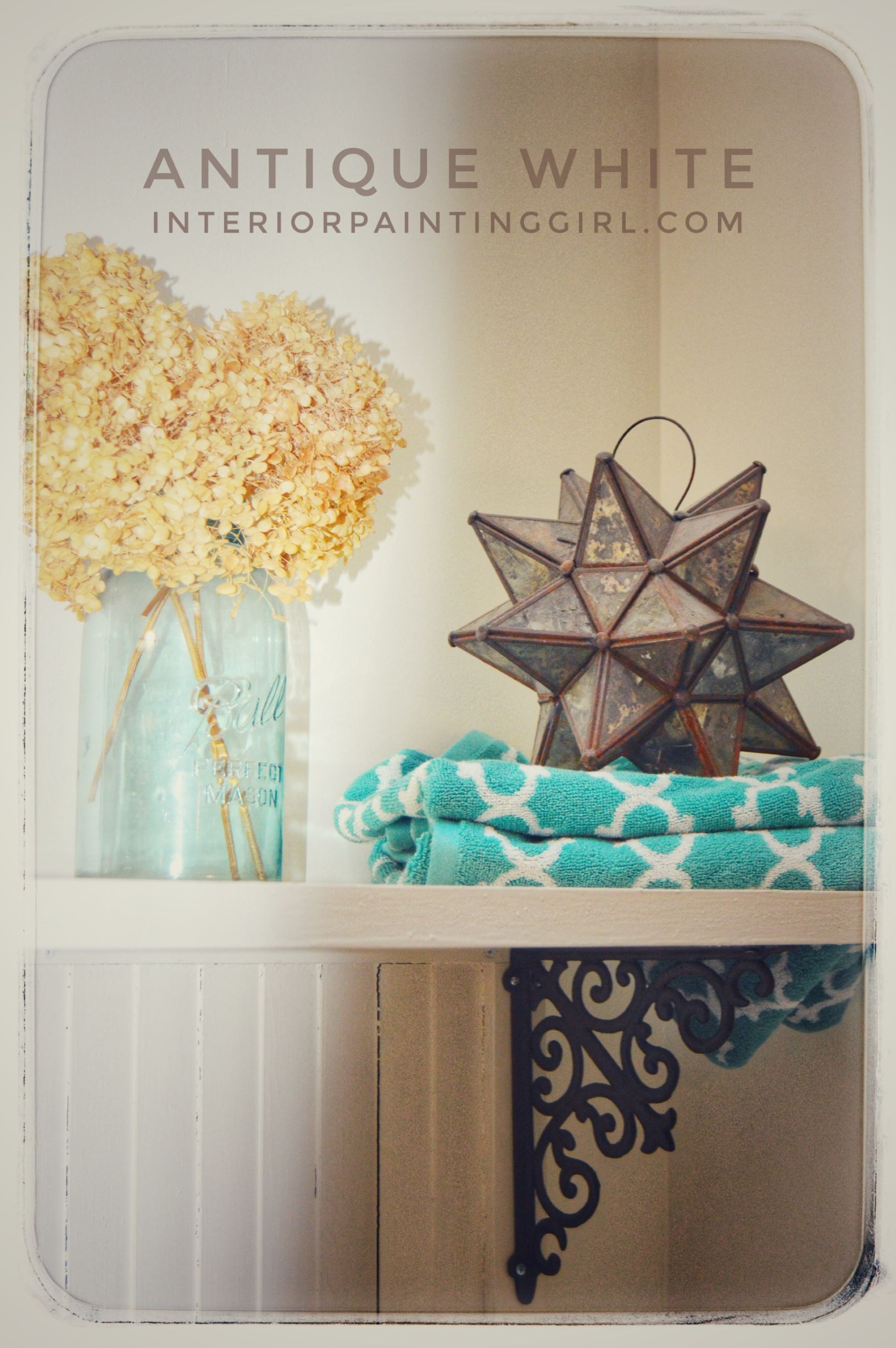
"Antique White" by Sherwin Williams
This is a rich and creamy white with just a touch of something extra that makes it sing in the sunshine. Less sterile than a traditional white but with all the longevity and flexibility. Use this as a background in any room and let your accessories do the talking. Classic versatility is what makes this one of the best interior paint colors!
"Chateau Stone" by Dutch Boy
Many times my clients express an interest in something that feels warm and sunny but shy away from bright yellows because they are garish or too infantile. Look no further than this perfect creamy yellow alternative. It’s warm and friendly but with just enough brown earthiness to mellow the yellow. I especially love it in kitchens and big open family rooms, where it has the glow of sun-soaked Cotswold stone.
"Gentleman's Gray" by Benjamin Moore
Don’t let the “gray” part fool you. This is a deep, luxurious navy that screams sophistication. If you’re apprehensive on using this in a large space, don’t be. Scientifically, darker colors make the walls appear to recede and can enhance your depth perception.
This color is fantastic in an upscale living or dining room or master suite, and works excellently as an accent wall or accent color. The classic elegance is what makes this one of the best interior paint colors, and it pairs well with anything from mustard, coral, or white to grass green and many things in between.
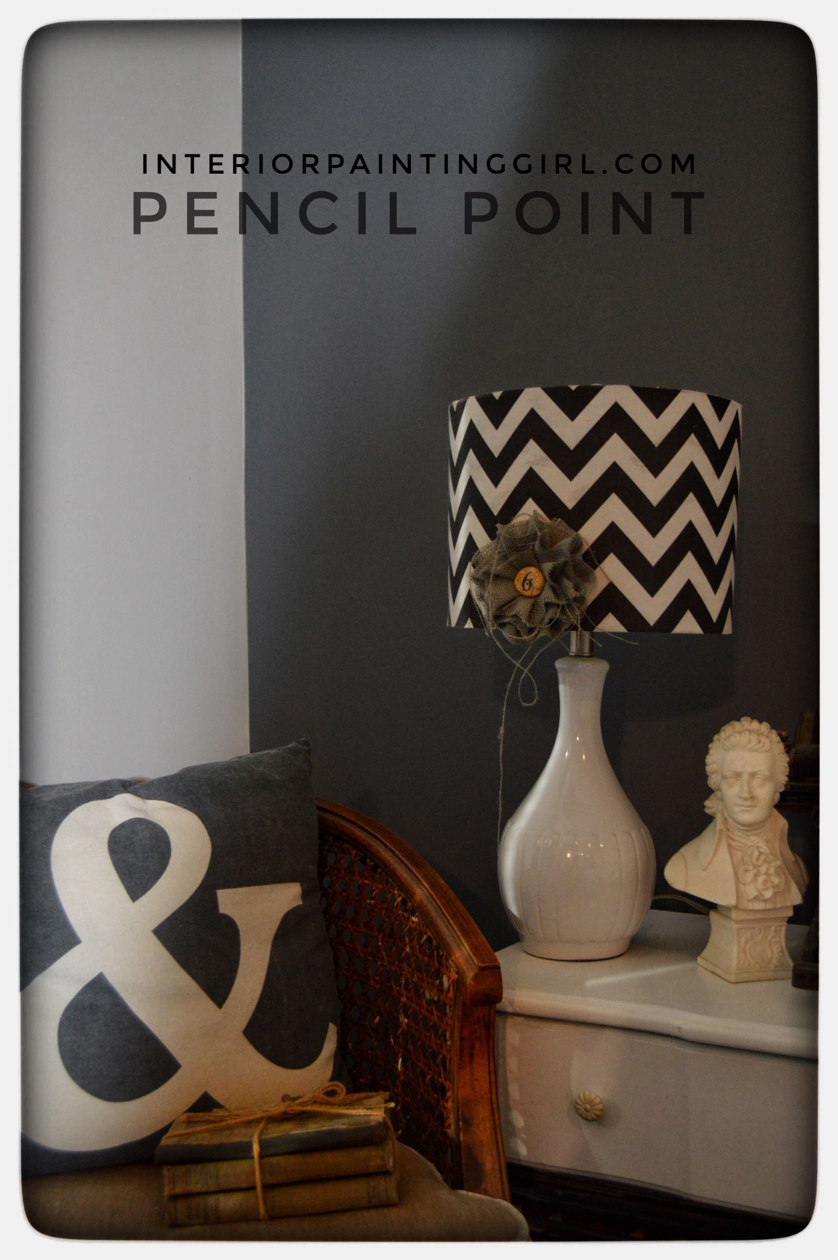
"Pencil Point" by Behr
There’s a huge trend toward farmhouse and industrial decor, and gray has definitely become the most popular “go-to” neutral. Truth be told, the reason farmhouse decorating is so popular is because of an awareness of upcycling old treasures into new to be both earth-friendly and vintage.
Both farmhouse and industrial design are making the “old” new again. And that is great for grays. Pencil Point is a deep graphite gray that creates a gorgeous pop or contrast with pearl and oyster shades. It’s also fabulous with aged, rugged leathers and suedes. The intensity of this gray is what makes it sexy and almost androgynous, perfect for both private spaces such as bedrooms and shared family spaces such as living rooms or dens.
"Chippendale" by PPG
This is a cozy, scrumptious brown that looks on the walls the way chocolate feels in your mouth. Need I say more? I love this in rooms where you play with natural-colored stones, such as a fireplace surround or as a backdrop behind white or light wood cabinetry. It also looks great with any other earthy color such as sage or terra-cotta or with teal for a modern twist! The warm and inviting feel of this brown tone makes it one of the best interior paint colors.
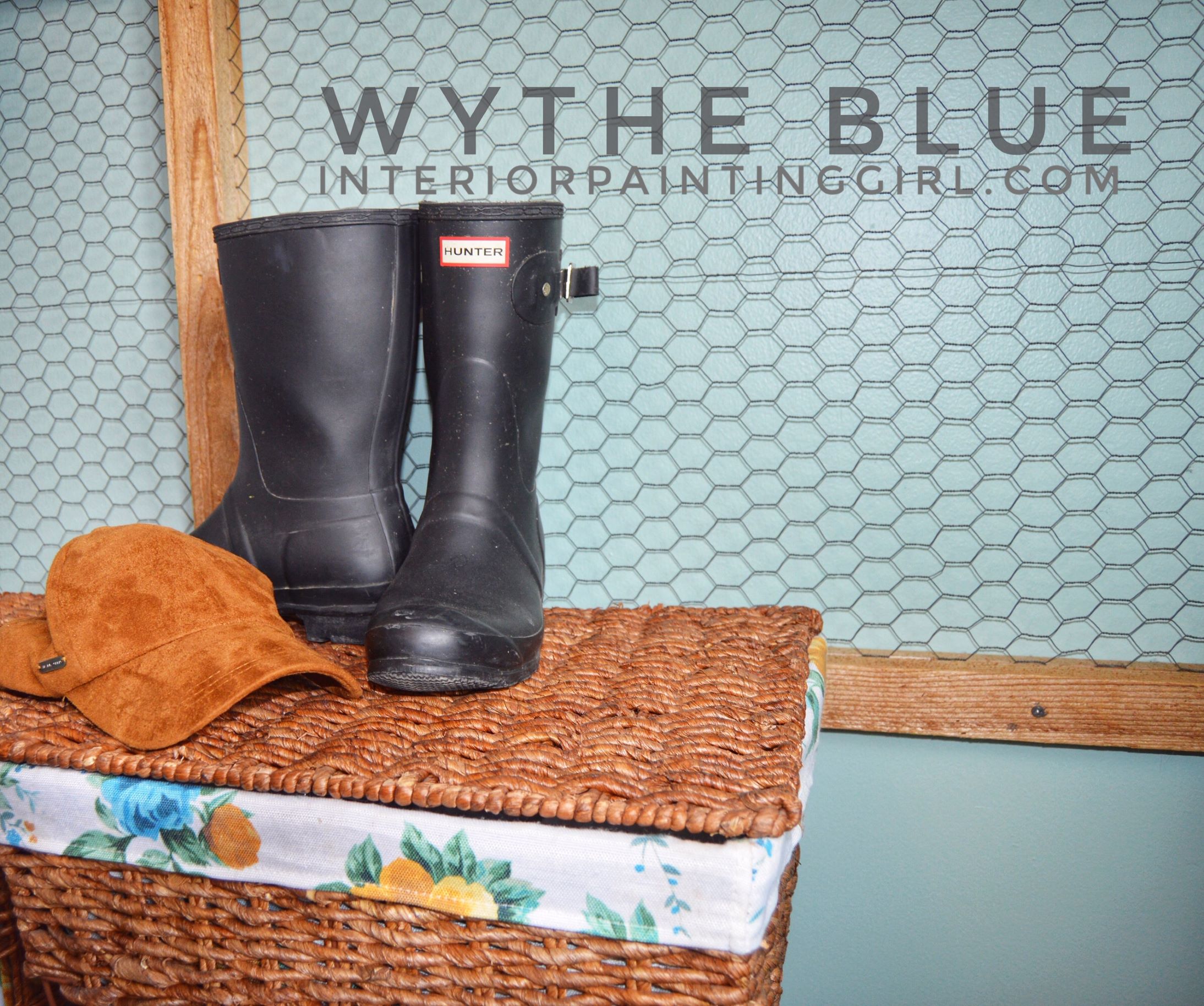
"Wythe Blue" by Benjamin Moore
This color straddles the line between light blue, green, and even gray. It’s that perfect chameleon color that makes you think of vintage dishes, Grandma’s apron, or beautiful sea glass. Soothing and calm, this is great anywhere from kitchens, baths, bedrooms, to porches, and even painted, heirloom furniture pieces.
"Lovely Peacock" by Kilz
Although this isn’t as neutral or versatile as many of the other best interior paint colors, it is without a doubt a favorite! If you’re looking for something striking and irresistible this is it. I’ve gotten more compliments on this color than any other, period! There’s a reason for the old saying “pretty as a peacock”. Pretty (& lovely) indeed and surprisingly it coordinates well with other colors, especially light browns. Let this color strut its way into your home and watch the compliments unfold.
"Burnt Sienna" by Benjamin Moore
Burnt Sienna is a warm and spicy color that feels Mediterranean and bright, combining terra-cotta red with a deep earthy tone. It brings to mind autumn colors, warm clay, pottery, bowls of hot soup, and luxurious suede. The reason this works so well for me (& my clients) is again the frequency it occurs in nature. Take a cue from the Navajo tradition of pairing this with turquoise or sprinkle it generously amongst the other sylvan colors of green, browns, and creams. Fantastic in kitchens, sunrooms, and open living spaces.
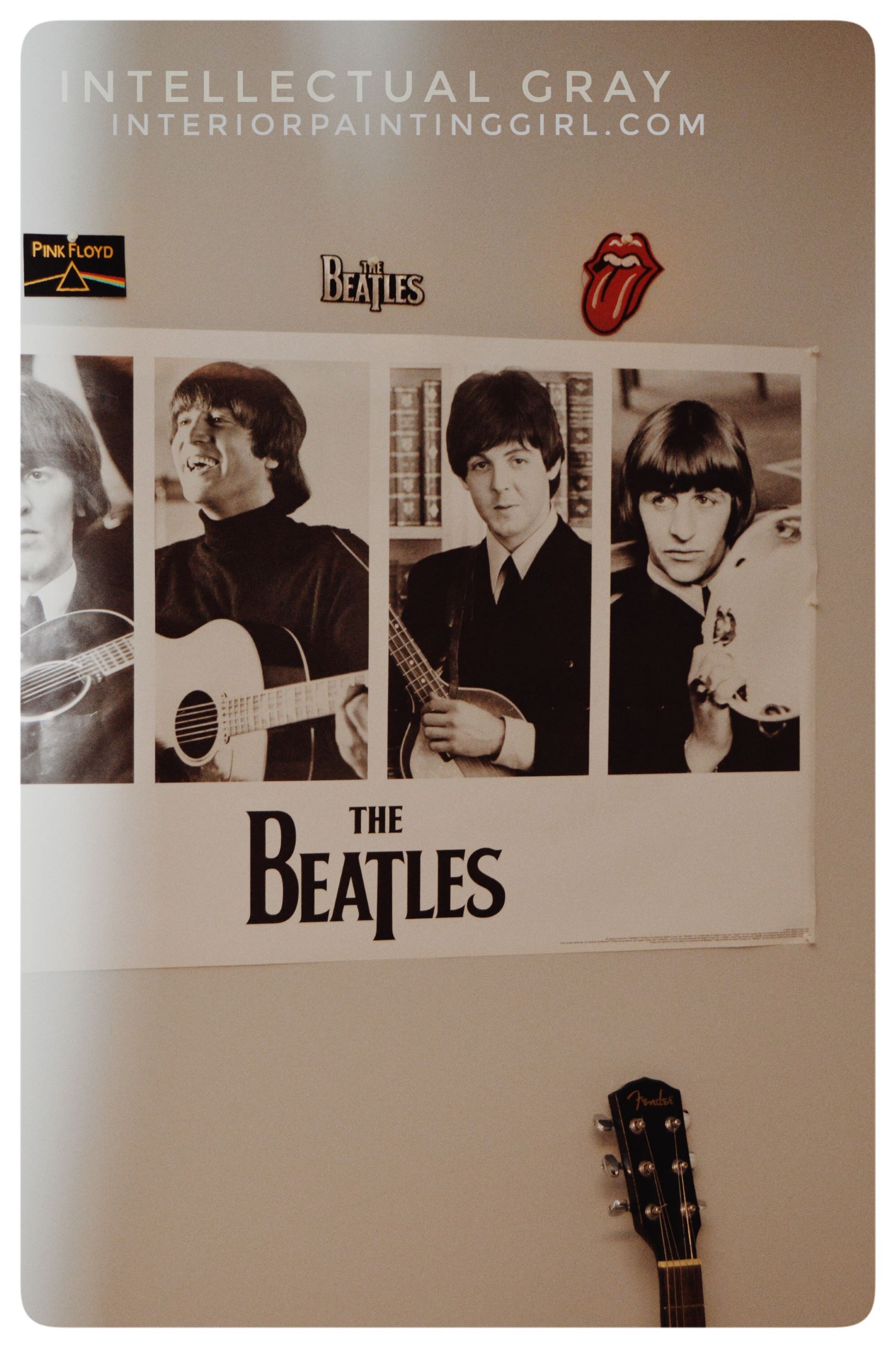
"Intellectual Gray" by Sherwin Williams
Is it gray or is it beige? In my opinion it’s the perfect “greige”, and no list of best interior paint colors would be complete without one. Sometimes beige is a touch too warm for a space and gray is too cool.
Intellectual Gray walks the line and lends itself to being one of the smartest and easiest colors to decorate with. I’m a big fan a chameleon colors that seem to adapt to the lighting and décor of a room. And this is polite enough to adjust to its surroundings. When you want color but are afraid of commitment, this stone-like hue plays nice with others and will conform to any aesthetic.
"Limousine Leather" by Behr
There’s a reason every woman should have a classic black dress in her closet and every man a suit. Black is a timeless staple that can be used time and time again in many different ways.
Limousine Leather has ultimate urban, upscale appeal mixed with the utilitarianism of a black Hunter boot. Wear, er…PAINT this anywhere you want to be able to switch things up often and still get longevity and any place you want to steal the show. Evoking the glamour of Audrey Hepburn and the devilishness of James Dean, black is where it’s at.
"Dill Weed" by Benjamin Moore
I love this soft yet invigorating green that brings a touch of the outdoors inside. Greens are so easy to work with because they occur so frequently in nature. We are instantly soothed and made comfortable in rooms that feel natural.
"Dill Weed" is complimented by many other colors. Think sunny yellow, blue skies, tree trunks, and rose petals. They all work well with green so you can rest assured that you’ll have plenty of style options and neutrality with this hidden gem. Dill Weed is one weed we wouldn’t mind finding everywhere.
